At a Glance
- Tableau, Looker, Sisense, Domo, Qlik Sense, and Zoho are the best AI tools for data visualization that will help data scientists and business intelligence organize and analyze their data better in 2023.
- AI algorithms create data visualization and discover hidden patterns and insights to analyze your data.
- There are several data visualization techniques that these tools use, including Automated Charts and Graph Creation, Pattern Recognition, Interactive Visualizations, and Predictive Analytics.
Data visualization is the graphical representation of data in charts, graphs, and maps. The aim is to turn different data sources into easily understandable and interpretable models of vast and complex datasets.
The use of data visualization helps identify patterns, trends, and relationships within large data sets. It is a valuable tool for data analysis and the decision-making process.
Artificial Intelligence is helping make sense of massive amounts of data into useful visualizations and analytics. AI algorithms create data visualization and discover hidden patterns and insights to analyze your data.
These insights help data analysts and scientists make more informed decisions that might otherwise be impossible.
Check out the six best AI tools for data visualization that will help data scientists and business intelligence organize and analyze their data better in 2023.
This article also discusses data visualization techniques, including Automated Charts and Graph Creation, Pattern Recognition, Interactive Visualizations, and Predictive Analytics.
In addition, we have written a short overview of the best data visualization tools, highlighting their best data visualization features for every use, so you can choose the top data visualization tool that suits your requirements.
1. Tableau – Best for Predictive Analytics
Tableau is a data visualization platform that transforms data for problem-solving by allowing users to import data and predict potential outcomes.
It helps analysts, data scientists, executives, and big businesses to make the most of their data. With its powerful tools, Tableau builds a data culture to transform businesses with limitless potential.
Tableau Top Features
- CRM Analytics
- Data Reporting System
- Embedded Analytics
- Data Visualisation
1. CRM Analytics:
Its Customer Relations Management (CRM) empowers salesforce users with actionable insights and AI-driven analysis that improves workflow.
Its powerful analytics help you identify cross-selling and upselling opportunities on call times.
In addition, it provides you with predictions and perspective recommendations for better customer relations.
2. Data Reporting System:
A centralized data reporting system that allows connecting each workbook independently.
Its virtual connections help you create and share a central access point. This enables you to pick important tables for analysis that makes management easier.
In addition, you can combine extracts and queries to reduce strain on your data warehouse and Tableau setup.
3. Embedded Analytics:
You can make Tableau’s analysis features part of your product for a smooth experience. Improve customer satisfaction by adding data with customized analytics directly.
4. Data Visualization:
You can convert raw data into a variety of visualization for business intelligence.
Tableau Prices & Plans
Tableau Creator
This plan is best for data analysts.
Features: Tableau Desktop, Tableau Prep Builder, and one Creator License of Tableau Cloud.
Price: $70/user/month billed annually.
2. Looker – Best for Data Insights and Analytics
Looker is a business intelligence and great data visualization tool that allows users and organizations to get data insights and analytics.
Looker integrates with many data sources, including databases and data warehouses. As a result, it supports a variety of use cases, including data exploration and data reporting.
Its data-driven insights help you create a better user experience, reduced development costs, and generate revenue streams.
Looker Top Features
- Business Intelligence Solutions
- Growth-Driven Embedded Analytics
- Multi-Purpose Dashboard
- Versatile Data Visualization Tool
1. Business Intelligence Solutions:
Small and big enterprises can use its cloud data platform to deliver business intelligence solutions.
Its ready-to-use analytics for eCommerce, media, ad tech, and SaaS helps you optimize real-time campaigns for more ROI.
2. Growth-Driven Embedded Analytics:
Its embedded analytics feature allows you to ship to data-driven apps and design your dream apps to maintain control of your data with more expertise and speed.
You can improve your workflow and gain valuable insights with marketing, product, sales, and web analytics tools.
3. Multi-Purpose Dashboard:
With its interactive and dynamic dashboard, you can monitor your operations actively.
One dashboard for sales reps, one for customer success managers, and one for external viewers give you more control and flexibility.
4. Versatile Data Visualization Tool:
It allows important data to be seen as sunbursts to stopwatches, funnels, and gauges.
You can also customize your visualizations for more specific purposes.
Looker Pricing & Plans
1. Looker for Startups:
This plan is designed for early-stage startups and costs $3,000 per year for up to 10 users.
2. Looker for Small Business:
This plan is designed for small businesses and costs $6,000 per year for up to 10 users.
3. Looker for Business:
This plan is designed for mid-sized businesses and costs $50,000 per year for up to 20 users.
4. Looker for Enterprise:
This plan is designed for large enterprises and costs $100,000 per year for up to 50 users.
Looker offers custom pricing options for larger organizations or those with more complex needs based on the number of users, data volume, and required features.
3. Sisense – Best for Embedding Analytics
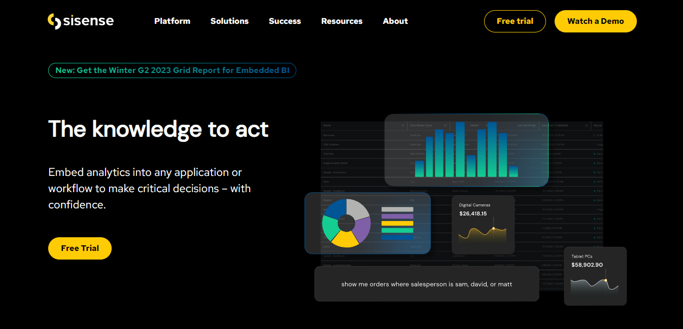
Sisense is an AI-driven platform that provides intelligence and works as data analytics software at the right place and time.
Its helpful features go beyond traditional business intelligence. It infuses analytics everywhere, including customer and employee applications and workflow.
Sisense Top Features
- Fusion Embedded Analytics
- Data Insights Extraction
- Fusion Analytics
1. Fusion Embedded Analytics:
It seamlessly integrates analytics into your product or service with customizable features regardless of your tech stack.
Its predictive intelligence with natural language querying empowers customers. It provides you with data from multiple sources and automatically turns them into insights with AI’s power.
In addition, it allows complete control with end-to-end governance and security to protect user data.
2. Data Insights Extraction:
You can work with data in the tools you already have to unlock insights without going to the dashboard.
It eliminates barriers that lock data away in specialized AI environments.
Whether using Google Workspace, Teams, or Office 365, you can fetch and share data insights where you work.
3. Machine Learning:
You can use code, low code, and no code for data analysis, investigation, and visualization.
With the help of machine learning, Sisense uncovers opportunities and makes outcomes accessible through natural language narratives.
As a result, it offers intelligent decisions without technical expertise.
Sisense Pricing & Plans
1. Subscription Based:
Sisense offers subscription pricing starting at $1,000 per month for a basic package, which includes up to 5 users and 50 GB of data. After that, the pricing increases per the number of users and data storage required.
2. Perpetual License:
Sisense also offers a perpetual license option, which provides a one-time cost for the software and ongoing maintenance and support. The perpetual license pricing varies based on the specific needs of the organization.
3. Custom Pricing:
Sisense also offers custom pricing options for enterprise-level organizations with large-scale needs.
4. Domo – Best Cloud-Based AI Data Visualization Tool
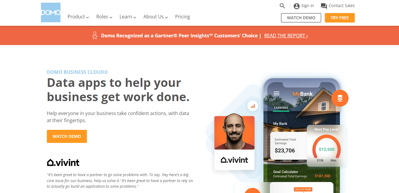
Domo extends the power of your raw data and supports data analytics and apps for your customers and partners for an increased workflow and ROI.
Domo Top Features:
- Customizable Dashboard
- Self-Service Analytics
- Embedded Analytics
- Data Visualization
1. Customizable Dashboard:
You can tailor its dashboard according to your business metrics. No technical expertise is needed to automate reporting that puts data to work.
Instead, it delivers data insights that lead to data-driven decisions, whether IT, Finance, Marketing, or C-suite.
2. Self-Service Analytics:
Its data analytics tools help make data accessible to everyone, bring transparency to your data, and drive faster action.
Its self-service analytics tools allow IT teams to focus on more strategic initiatives.
You can access your data from hundreds of data sources like spreadsheets and databases.
3. Embedded Analytics:
Customers and partners can automate tailored reporting that brings insights faster, making your ecosystem more agile and responsive.
4. Data Visualization:
It has one of the best data visualization tools available. Its free data visualization tool allows users to visualize various data from various data sources into interactive dashboards and reports.
Domo Pricing & Plans
Domo’s pricing structure can be complex and depends on several factors, such as the number of users, data sources, and advanced features required. For more accurate details about the pricing of each feature, contact the Demo sales team.
However, there are three basic plans.
1. Starter:
Features include basic data visualization, dashboard creation, and mobile access.
Pricing: Designed for small businesses and starts at $83/user/ month, billed annually.
2. Professional:
Features: It includes more advanced features such as data blending, collaboration, and predictive analytics.
Pricing: Designed for mid-sized businesses, and starts at $175 per user per month when billed annually.
3. Enterprise:
Designed for large organizations and offers customized pricing based on specific needs.
5. Qlik Sense – The Best Self-Service Visualization
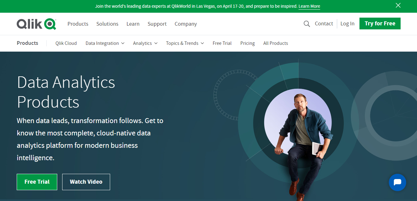
Qlik Sense is a data visualization software that offers choice, flexibility, and security with its hybrid deployment options to store and analyze data.
In addition, its powerful integration and analytics tools like iPaaS help data engineers to make more guided decisions.
Qlik Sense Top Features
- Self-Service Visualization
- Interactive Dashboard
- Advanced Analytics
- Custom And Embedded
1. Self-Service Visualization:
It offers interactive charts, tables, and maps, making it the best data visualization software.
You can easily combine, load, visualize, and explore large data. Its vast library of smart visualizations reveals your data’s true shape, meaning, and insights.
In addition, you can get assistance from its insight Advisor for auto-generated analysis.
2. Interactive Dashboard:
You can create, share, and distribute dashboards with interactive elements. It provides users with a powerful platform to make better, data-driven decisions.
3. Advanced Analytics:
With its real-time integration with machine learning models, you can easily explore calculations and predictions.
4. Custom and Embedded:
It has a complete set of open APIs that enable you to customize analytics. You can develop custom apps and new visualizations and embed fully interactive analytics within the applications and processes.
Qlik Sense Pricing & Plans
1. Qlik Sense® Business:
Features: Cloud solution to operationalize analytics across groups and teams.
Pricing: $30/user/month. Billed annually.
2. Qlik Sense Enterprise SaaS
Features: Cloud solution to scale and extend analytics across departments and organizations. You have to contact sales for pricing details.
Note: The pricing may vary depending on your location, the number of users, and the specific features you need. It’s best to contact Qlik directly to get an accurate quote for your business.
6. Zoho – Best Augmented Analytics
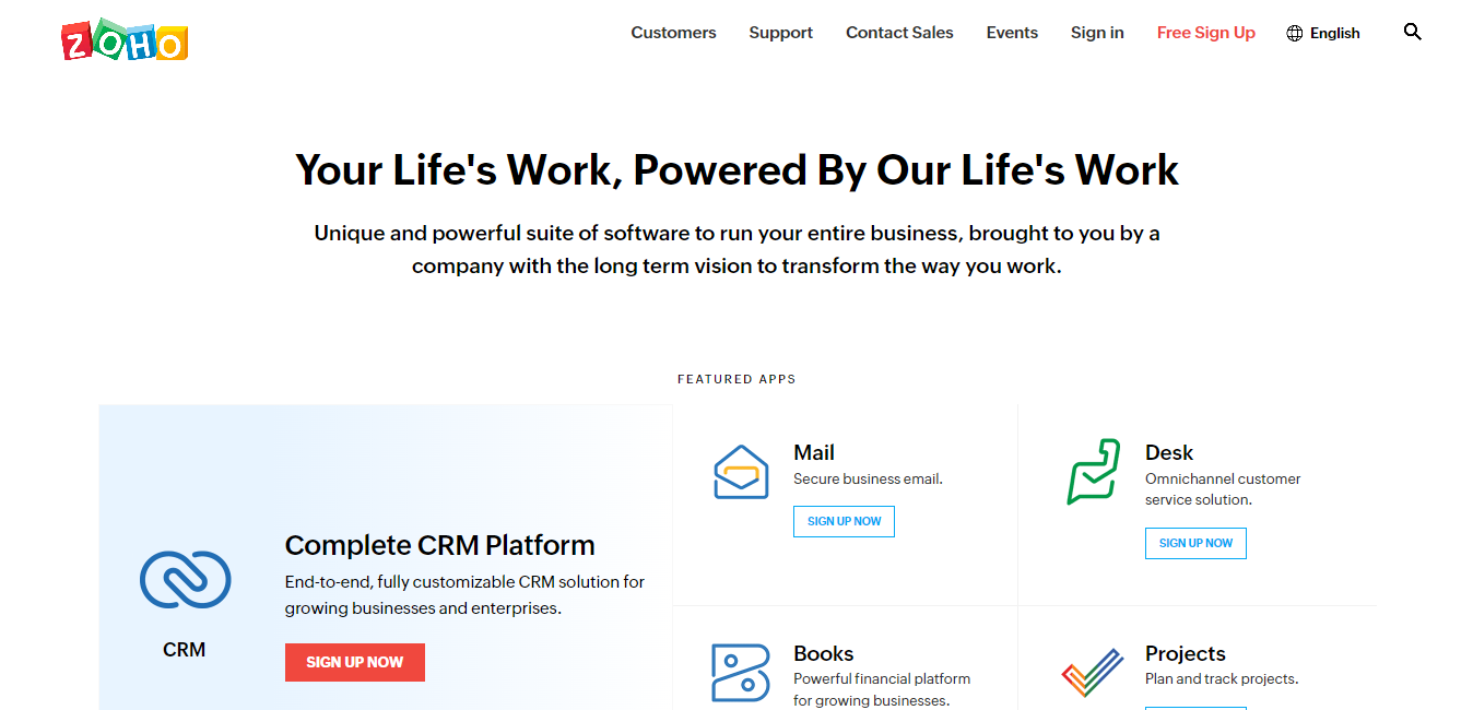
Zoho is a self-service business intelligence and analytics platform that connects and analyzes data by creating visualizations to discover insights.
Zoho Top Features:
- Visual Analysis
- Augmented Analytics
- Mobility
1. Visual Analysis:
It provides a variety of charts, widgets, and tabular views to create insightful reports and dashboards. For example, you can analyze your geographical data using interactive maps to measure key metrics across countries and regions using postal codes.
2. Augmented Analytics:
It offers contextual and actionable insights in the form of digestible narrations. You can also engage in conversations and get relevant reports as answers from its interactive Ask Zoho tool. In addition, its new feature of what-if analysis helps you find optimal business outcomes.
3. Mobility
You can access and interact with your data, reports, and dashboards from phones and tablets.
Zoho Pricing & Plans
1. Standard:
The standard plan costs US$14/user/month, billed annually.
2. Professional:
The professional plan costs US$23/user/month, billed annually.
3. Enterprise:
The enterprise plan costs US$40/user/month, billed annually.
4. Ultimate:
This top-tier plan at US$52/user/month is billed annually.
Note: Pricing may vary depending on your location and the specific features you need. Zoho offers a free trial for many of its products, so you can try them before committing to a paid plan.
Data Visualization Techniques
Data visualization is the representation of data or information in a graphical or pictorial format to make it easier to understand.
There are several techniques to analyze data and make more informed decisions, including:
1. Automated Charts and Graph Creation
AI algorithms automatically generate charts and graphs based on the data without manual intervention. This can help save time and effort and also ensure consistency and accuracy. In addition, data visualization makes data more accessible and easy to understand.
Examples of Automated Charts and Graph Creation
Line Chart:
This chart displays data as a series of points connected by lines. It is often used to visualize changes over time.
Bar Chart:
A bar chart represents data as bars of different heights, where the size of each bar corresponds to the value of the data being represented.
Pir Chart:
A pie chart is a circular representation of data, where each slice of the pie represents a different category of data.
Scatter Plot:
A scatter plot is a type of chart that displays data as points, with the position of each point on the graph representing the values of two variables.
Area Chart:
An area chart displays data as a series of areas, with the height of each area representing the value of the data being defined.
2. Pattern Recognition
AI algorithms recognize patterns in data that might not be obvious to a human analyst. This can help to identify correlations, relationships, and trends in data that might not be visible from just looking at raw numbers.
Examples of Pattern Recognition
Facial Recognition:
The facial recognition feature identifies a person based on their facial features.
Speech Recognition:
It’s an ability of a computer to transcribe spoken language into text.
Handwriting Recognition:
This feature identifies handwritten text.
Object Recognition:
It identifies objects in an image or video based on their characteristics, such as shape, color, texture, and size.
Fingerprint Recognition:
This feature identifies an individual based on their unique fingerprint patterns.
Image Classification:
The ability of a computer to categorize an image based on its content, such as identifying an image as a picture of a dog, cat, or flower.
Anomaly Detection:
Ability to identify patterns that deviate significantly from normal patterns, which can be used to detect fraud or security threats.
3. Interactive Visualizations
A real-time interaction by users to explore data is called interactive visualization. Static visualization of data is difficult to analyze, and it is much easier to understand your data in interactive mode.
Examples of Interactive-Visualization
Geography:
Interactive maps display geographically important data in a way that makes it easy to analyze changes. For example, a choropleth map shows data by coloring regions based on a certain value, like popular density or per-capita income. It provides an easy way to analyze visual data and determine how variables change across a geographical area.
Finance:
We use interactive line graphs, bar charts, and scatter plots to analyze trade volume, economic indicators, and stock prices.
Medical:
Interactive visualizations display medical data related to disease outbreaks, patient data, and clinical trial results. For example, a scatter plot can show the relationship between two variables, such as the effect of a drug on a certain medical condition.
Sports:
Visualizing data such as player performance, team statistics, and game results. For example, a bar chart can display player statistics, such as goals scored, assists, and playing time.
Climate:
Interactive visualizations can display climate data such as temperature, precipitation, and atmospheric conditions.
4. Predictive Analytics
AI can make predictions about future trends and patterns based on historical data. These predictions can be visualized to help decision-makers understand the potential outcomes and make informed decisions.
Examples of Predictive Analytics
Customer Churn Prediction:
A company can use predictive analytics to identify customers likely to cancel their subscriptions. This can help the company take proactive steps to retain those customers.
Fraud Detection:
Data visualization software also helps financial institutions. For example, they can use predictive analytics to identify real-time fraudulent transactions by turning hundreds of data rows into an accessible form.
Predictive Maintenance:
This technique is used in manufacturing to predict when equipment will fail. In addition, it allows maintenance to be scheduled proactively before a breakdown occurs.
Healthcare Outcome Prediction:
It is used in the healthcare industry to predict patient outcomes, such as the likelihood of readmission or a patient developing a certain condition.
Marketing Campaign Optimization:
Companies can use predictive analytics to optimize their marketing campaigns by identifying which types of customers are most likely to respond to a particular marketing message.

